MP16 | Miyazaki and CGI

Princess Mononoke (1997) release poster.

Hayao Miyazaki is globally lauded as a master director of the Japanese animated feature. His and the late Isao Takahata’s animation studio Ghibli is well known for its track record of making beautiful traditionally animated films ever since Castle in the Sky in 1986. (It should be said, too, that Japanese anime generally has retained its stylistic preference for 2D animation rather than CGI, unlike US feature animation which has generally turned 3D.)

However, Miyazaki’s more recent work that marked his breakout on an international level show a turn to digital techniques in order to fully achieve his films’ artistic visions. Starting with Princess Mononoke (1998), Miyazaki began to integrate computer graphics (CG) into his traditional pipeline, and his subsequent films Spirited Away (2001) and Howl’s Moving Castle (2004) included progressively more CG. Miyazaki’s techniques for these films is based around the philosophy of “CG that doesn’t look CG”. Still using cel animation and hand-painted backgrounds as starting points, 3D elements are included in order to better support three-dimensionality and visual effects that are not doable in traditional cel animation.

For the CG animation in Mononoke, the majority of which was still traditional cel animation, Studio Ghibli worked with Microsoft to develop Toon Shader, a software to make 3DCG made in Softimage look like hand-painted cel images. This was one of the first forays (if not the definite ‘first’) into creating crisp ‘cel’ shading on 3D objects, which is now commonly used in anime and games to evoke a 2D aesthetic.

The cel shading 3DCG method was important for the creation the demon sequence in the beginning of the film, where the tendrils were very difficult to animate individually. Fig. 1 shows the breakdown of one of the shots: the first two images show the tendrils’ wireframe and the resulting 3D object generated with Softimage, the third image is the 3D put through Toon Shader for a cel-shaded effect, and the fourth image shows the tendrils composited on to the hand-drawn character cel. Other uses for 3D simulation include water, which features prominently in Spirited Away.

Fig. 2
.

Generation of particles was another important 3D technique. In Fig. 2, the Nightwalker’s main body animation was done on cels, but the bioluminescent dots are generated in 3D and controlled by input variables. The same principles of particle generation were applied to generation of smoke and steam.

Background animation was another issue that was aptly addressed by CG. Fig. 3 shows a shot from Miyazaki’s earlier work Porco Rosso (1992) in which the camera tracks the moving airplane over a long distance. The background hills are entirely animated on cels, while the sky and clouds are a BG painting.

Fig. 3

For a similar moving-over-a-hill shot in Mononoke (Fig. 4), 3D mapping was used to ‘move’ an otherwise hand-painted background in physical 3D space. The top image in Fig. 4 shows the 3D plane, and the 2nd image shows the background painting mapped onto the plane. This would allow for better immersion, as seen in the finished animation (Fig. 5); it gives the illusion of the camera moving through space, as the hill is not an animated cel like in Fig. 3.

It is important to note that it is a POV shot, unlike Fig. 3, and using a mapping technique for a background is more apt for the shot’s function in the story. The purpose of the shot is for the black plume to be slowly revealed behind the hill, so the hill in the foreground cannot distract the audience by appearing as flat cel animation.

Fig. 5

Mapping hand-drawn images onto 3D surfaces or objects was once again used in Spirited Away; in the sequence when Chihiro finds her parents have turned into pigs (Fig. 6) Miyazaki faced the issue of animating the Chinese bowls with the flatness of cels while being shown against a painted background, alerting the audience that it would move before it actually did. This was solved with texture mapping, in which the bowl was first painted with the same quality and detail as the background, and then mapped onto a 3D generated bowl that was later animated.

Fig. 6 – notice that the bowl on the top left in the first shot is CGI.

Another important part of the digital pipeline is digital compositing, which allowed for theoretically infinite layers of scanned (or computer generated) images to composite for the final result, as it did not depend on optical photography of ‘books’. A highly complex shot like Fig. 7 requires separate layers for the limbs, body and shading/lighting of each susuwatari and each piece of charcoal.

Fig. 7

Many shots end up becoming a combination of techniques: hand-drawn materials mapped on to 3D (or otherwise digitally manipulated), pure 3D generated effects, and digital compositing. Fig. 8 is a Spirited Away still from a shot seen from the window of a moving train. The house and island were cut from the original background painting and manipulated as a 3D object to achieve the slight change in angle as the camera passes by the scene. The water effects were created largely with 3D software. The parallax effect is achieved by the many layers possible in digital compositing: the water, island, and clouds at different distances are tweened at different speeds.

Fig. 8
The castle in Howl was very meticulously digitally composited from hand-painted parts!

Through careful and deliberate integration of handmade and digital, Miyazaki was able to take advantage of CGI in order to push his film quality to new heights. It is interesting that his implementation of digital techniques coincided with his works’ exposure to the Western market. Perhaps there is a correlation, or perhaps it is just a result of a director willing to experiment with whatever would best help him to “make something beautiful”. And indeed, made something beautiful he has.

References

  • Hayao Miyazaki. Wikipedia. https://en.wikipedia.org/wiki/Hayao_Miyazaki.
  • The Art of Princess Mononoke: A Film by Hayao Miyazaki. English adaptation by Takami Nieda. Viz Media, San Francisco. 2014.
  • The Art of Miyazaki’s Spirited Away. English adaptation by Takami Nieda. Viz Media, San Francisco. 2013.
  • The Art of Howl’s Moving Castle. Tohan, Taipei. 2005.

MP15 | Asian ink wash animation and the digital age

In the class on Chinese animation, we saw works done in a painstaking ink wash style, creating moving Chinese ink paintings.

Te Wei is the principle founder and master of working in Chinese ink-wash animatoin (水墨动画, shuimo donghua). These works were made on many separated cels of ink strokes, meticulously organized and layered in compositing. The results combine the dynamism inherently suggested by ink wash brush-strokes with actual movement, as well as the stylistic minimalism that Chinese ink paintings have.

Te Wei‘s Tadpoles Searching for Mother (1960)
Te Wei’s Feelings of Mountains and Waters (1988)

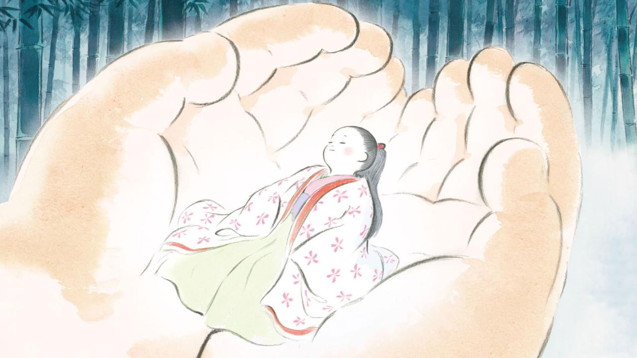
Although how aged these films are would suggest ink wash animation is an experimentation of the past, it lives on into the digital era, albeit perhaps as an uncommon fringe style. The late Ghibli master Isao Takahata’s film The Tale of Princess Kaguya (2013) was done entirely in a sumi-e style, to a beautiful hand-drawn effect. The coloring was done with digital paint, but the fact that it is computer-made does not take from the visuals at all.

Expresii, a drawing program aimed at simulating ink and watercolor with digital software. The results are very high fidelity. Demonstrations of the app in action are as follows:

Rooftop animation, a Hong Kong animation studio lead by SCAD alumnus Angela Wong, had been working on a film using Expresii. Though the project was unfortunately cancelled, a demo teaser can be seen here:

Another completed film by Rooftop animation is Green Earth (2017), created with a combination of traditionally hand-painted and digital ink-wash drawings.

The power of digital programming has in fact facilitated the ease of (re)creating the unique Asian ink wash style. Though it would be wildly unrealistic to say it can compete against both 3D animation and other sharp, comic book-like 2D animation, I hope that it can continue to be used in animation productions, and appreciated by wider audiences as an aesthetic steeped in history and culture.

MP14 | “Ryan” – a documentary by Chris Landreth

In 2001, Chris Landreth interviewed Ryan Larkin, award-winning Canadian animator and at the time of the interviews, a panhandler recovered from drug abuse and reliant on alcohol. Based on multiple recorded interviews, Landreth and his team at Toronto’s Seneca College created the visuals in Ryan, a 14-minute animated documentary that would go on to win Best Animated Short Film at the Oscars.  

It is indeed a brilliant work; Ryan is easily one of the films I found most interesting in this course. The majority of the film is presented in a mirrored reality, where perspective does not seem to be linear and the grotesque characters’ psychological scars are shown externally. The CGI and 3D animation is aptly employed to do this to a viscerally disconcerting yet visually arresting effect.

The most intriguing is Ryan’s model, his body skeletal and his head almost hollowed out. Little arms on his thermos distracting him clue in to his alcoholism, which is the climax of the film when Landreth brings up the subject, and Ryan reacts aggressively, red literally spiking out from his head. It also includes touching moments where Ryan’s face almost begins to reconstitute itself, such as being reunited with one of the frames of his animation and speaking to his previous partner Felicity whom he still regards fondly. The film paints Ryan’s figure as a once-successful and prolific artist, suck in his predicaments, as the film says “living every artist’s worst fear”.

The film references and gives background to Larkin’s two famous works Walking (1969) and Street Musique (1972), both of which were done with Canada’s National Film Board and won many awards and nominations. They are worth viewing for their whimsical mood and style, all painstakingly done traditionally with various media (including watercolor).

Ryan Larkin’s Oscar-nominated short Walking (1969)
Larkin’s film Street Musique (1972), using morphing techniques

References

MP13 | American wartime animation (part 3: information)

Despite — or perhaps because — wartime being a time of tension and uncertainty, the American animation industry consolidated its forces towards the Second World War effort. Animation was used as a medium to portray war, to instruct, and to disseminate messages. This is the third and final part of the series.

In the previous part I looked at wartime animation as propaganda, mainly sending anti-Nazi messages and satirizing Hitler. This section deals with films carrying more specific calls to action, aimed at the home front in the United States during the Second World War.

Informative and educational animations were high in demand, some for the purpose of training troops, and others for civilians at home. The example we saw in class is the black and white Looney Tunes: Point Rationing of Foods (1943). It was commissioned by the Office of War Information, produced in collaboration with UPA, directed by Chuck Jones. It sought to inform Americans on the wartime rationing system. As an informative film, it uses a very graphic, modern style, and, its many use of holds make it somewhat more a graphic reel rather than a fully animated film.

While in the throes of aiding the WWII Allies, the US also had presidential elections, and President Franklin D. Roosevelt was up for re-election. Hell-Bent for Election (1944) was made for his election campaign, sponsored by the United Auto Workers and directed by Chuck Jones. It is UPA’s first major success, displaying its stylish graphic aesthetic and dynamic camera angles.


Victory Through Air Power (1943) was not shown in class, but I had seen it referenced in many histories and biographies of Walt Disney or his eponymous studio. It was based on the book of the same name by Alexander de Seversky, an aviation expert and strategist. A 70 minute feature film, it came about when Disney read de Seversky’s book and felt compelled to disseminate his theories on air bombing strategies, and how this would lead to the Allies’ victory. The film was apparently even shown to and approved of by Roosevelt.

As a bookend I’d like to bring up Brotherhood of Man (1945), directed by Bobe Cannon and John Hubley. In the wake of WWII, which for America was a commercially successful war and saw society more unified than ever to support the war effort, there was continued enthusiasm for societal cooperation in America, much like during the wartime. Previously overlooked sectors of society like women and ethnical minorities, now had unprecedented contribution and standing in the workforce. The short serves as an educational video against racial prejudice in post-War America.

To summarize, this three-part series aimed to look at animation as a vehicle for the American war effort in WWII, as well as a way through which to illustrate society and important historical events in America in relation to the war.  

Sources:

MP11 | American wartime animation (part 1: the cautioning)

Despite — or perhaps because — wartime being a time of tension and uncertainty, the American animation industry consolidated its forces towards the Second World War effort. Animation was used as a medium to portray war, to instruct, and to disseminate messages. This is the first part of a three-part series.

Although Peace on Earth (1939) was not a film made for the war effort, it was released two months after WWII started in Europe, and its portrayal of war I find interesting and important enough to include as a forward to animations that are more strictly propaganda in nature.

It is an anti-war, pacifist film produced by by the Metro-Goldwyn-Mayer company. It was presumably made during the collapse of international relations between the Allied and Axis Powers in the late 30’s, but definitely before the United States joined WWII.

Peace takes place in a hypothetical post-apocalyptic earth, where humans have wiped each other out while waging war, and woodland animals have taken over and are now re-telling the stories of humans’ wars. The film seems to be cautioning against war with the hindsight of WWI, which was the largest scale war known to humankind at its end in 1918, and was even then called ‘the war to end all wars’. It certainly depicts war as brutal: the battlefield sequences are very realistic and well made, in stark contrast to the joyful cartoon animals.

Interestingly this film was remade after WWII with a different scenario, and even more brutal war scenes showing more technically advanced weapons than Peace on Earth, in light of the many innovations in weaponry in the actual war, including the nuclear bomb.

The rest of the series will dive into the many types of animation made during the war effort.

MP10 | Thoughts on UPA and Hubley (part 2)

The Tell-tale Heart (1953) produced by UPA is an amazing work of psychological horror using animation that, in my view, perhaps consolidated cinematic methods of the horror genre and pioneered them in animation. The strong presence of the ‘camera’, its jittering and hovering movement, and its use to show the ‘point-of-view’ of the character is very immersive and effectively unsettling. UPA’s highly graphic style coupled with the strong light/dark contrast, culminate in a very innovative use of positive and negative space that might not be possible with a more realistic approach.

UPA’s John Hubley is the animator who stands out most to me, for his direction of Rooty Toot Toot (1951). From its adult mystery story and jazzy number to the visual style that is somehow as geometric and slapstick as it is sensual and human, it was delightful to watch and very memorable. Hubley was fired from UPA due to the Communist witch hunt of the 50s, but he continued innovating in animation, what seems to me towards a film-art or even fine-art direction. Together with his wife Faith, he made films such as Moonbird (1959) and The Hole (1962) which are narratively less linear, perhaps due to the improv/spontaneous element of the dialogue, which drives the story. While still using geometric shapes and minimal lines for character animation as in UPA’s style, what stood out to me was the highly artistic, almost painterly look of the textures, and the use of a multi-plane technique that created spatial depth.

UPA could be further discussed as an influence on animation at large. It would be interesting to investigate how it prompted other major animation studios such as Warner Bros. and Disney to experiment further in animation. UPA’s use of limited animation and flat shapes certainly had a widespread influence: Zagreb Films in Croatia (such as in the 1961 film Ersatz) adheres to these design principles, and Chinese animator A-Da’s work (Three Monks 1980 and Super Soap 1986) demonstrate them in a uniquely Chinese context and setting.

MP9| Thoughts on UPA and Hubley (part 1)

source
.

UPA (United Productions of America) was arguably a manifestation of discontent with Disney’s realistic animation style and harsh hierarchal and industrial production methods. The five-week strike at Disney in 1941 lead many staff members to leave the studio, and UPA was formally founded in 1934, originally called Industrial Film and Poster Service. As the year and name suggests, the studio initially found employment working on wartime films.

Focusing on the artistic implications (rather than the socio-economic, which is equally interesting) of UPA, I want to think of UPA as facilitating expansion and experimentation in animation, perhaps distinguished because it is separate from Disney. Where Disney unleashes meticulous detail to convince the audience of its believability, UPA draws large flat shapes, swathes of color in essence.

During its time as ‘IFPS’ it produced many shorts for the government. Hell-Bent for Election (1944)’s train sequence still amazes me as very unique and stylish in design. Brotherhood of Man (1945) demonstrated the graphic shapes, flat colors and line-less style that distinguished UPA from Disney and other mainstream animation houses.

Major Post 16: Oblivion and Front Projection

Last class, we talked briefly about an early visual effects technique called “front projection”. I found this interesting because I wondered how filmmakers would be able to project the images without the actors being in the way of the screen. I realized how it works after watching the Shanks FX video shown in class and another video I found.

Front Screen Projection by Shanks FX

Front projection is used to act as a backdrop for filmmaking. In the video by Shanks FX, most of the examples were using the projector with moving images. One of the examples that used this technique was a film called Oblivion. I was so excited to see this because I remember first watching this film years ago and seeing the behind the scenes footage. In the movie, several scenes are made to appear as though we’re many feet in the air. The filmmakers used a large open space and their projection screen wrapped all around the four walls, the corners curving gently to not disturb the image. In the center, they had their set pieces and props, such as a home with large glass windows and a futuristic helicopter.

Front Projection in Oblivion

The footage they used was of the movement of clouds with the sunrise and sunset, taken from a volcano in Maui called Haleakala. This was a great application of the front projection technique because building a set near a volcano and hauling filming equipment out there wouldn’t have been realistic. The filmmakers of Oblivion were able to achieve a seamless and believable environment for the film using front projection. I would like to give the technique a try as well, possibly in a future project!

Sydney McPherson

Major Post 16 – Animated Music Video

Same as my post 15, we learned about how animation was discovered and evolved. We really have to appreciate how animation has evolved and improved into from 18th century until now.

In the market nowadays, 2D animations are uncommon because as the technology is more developed, creating 3D CGI is more profitable and time-saving than 2D CGI animations, which it is required a large group of people to draw frame after frame. I talked about a special shader pack for 3D software is developed before, toon shader, which is inspired by cel-shading from 2D cartoon. One click with some setting adjustments, a shot can be done quicker than 2D animation. However, that doesn’t mean 2D CGI has been completely abandoned, it usually used as filled the shot with a background or post production ( special effects, lighting adjustment etc. ). Therefore, 2D animations are uncommon to see in the industry now.

Out of nowhere, Riot Games released an animated music video for promotion of in-game skin, GIANTS sung by True Damage ( A made up CGI characters group ), voiced by Becky G, Keke Palmer, SOYEON, DUCKWRTH and Thutmose. It is a media mixed with 3D environment and 2D character animations. It is an animation completely opposite of what the industry usually are, 2D main animations with classic cel-shading with 3D mesh and environment.

Major Post 15 – Kimetsu No Yaiba / Demon Slayer

Our class mainly focused animation from before but can we also appreciate how animation/anime from Japan has become now?

I think the best anime made recently is Kimetsu No Yaiba/Demon Slayer. In a world full of Oni or demons, bloodthirsty monsters that looked somewhat like a human with supernatural power, a family is attacked by demons and only two members survive, Tanjiro and his sister Nezuko, who is turning into a demon slowly. Tanjiro sets out to become a demon slayer to avenge his family and hopefully to find a cure for his sister. Not only the story plot is extremely exciting, the animation in this anime is very smooth and the amount of effects and element animations are insanely good.

Animating water is a very complex. In 3D animation production, water or liquid is always a challenge towards the studio even to professionals.

Tanjiro is a demon slayer so he will get quests for him to complete, slaying demons. He met Zenitsu Agatsuma and Inosuke Hashibira during quests and they became a team and friends. One time they have to go into the mountains to fight one of the strongest 12 demons under Muzan’s lead. Zenitsu and Inosuke were wounded and couldn’t battle anymore, left with Tanjiro and Nezuko to finish their job and save them from danger. All the episodes of the anime are well-made but that final fight scene in the mountain was jawing, all the camera angle, the actions and elements

animation.

This is my favourite part.